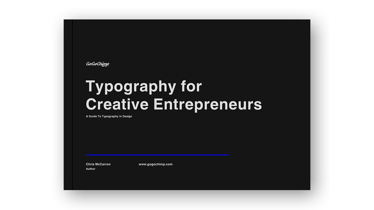
Free Typography Guide
Typography is easy when you follow these seven rules. Even if you lack design skills or a creative flair, this typography guide will show you how to create professional designs for your brand.
This article was originally published on the GoGoChimp blog and is found here: Typography Guide for Creative Entrepreneurs.
What is typography?
Typography is how designers use text to ensure clarity, legibility, and visual allure for the reader. It encompasses font style, aesthetics, and composition, striving to evoke particular feelings and communicate distinct messages.
It's a vital component of design that involves using pre-existing typefaces rather than creating new letterforms.
Yes, typography sounds boring when you try to explain what it is.
But trust me when I say that typography is indistinguishable from art.
And you don’t need amazing design skills to create a professional typography design for your brand and marketing.
Get Your Free Typography Guide Now
This 100% free PDF gives you everything you need to make award-winning designs using typography.
The 7 Rules of Typography
In this typography guide, we'll look at seven fundamental rules to get your typographic game on point.
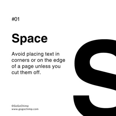
Typography Placement.
Never place your text in the corners of a page or along the edges. However, the exception to this typography rule is when you deliberately cut the text off (as demonstrated above).
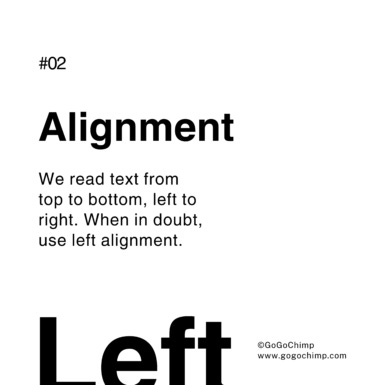
Typography alignment.
Typography is intrinsically art.
However, the core purpose of typography is to effortlessly convey important information to the viewer.
We've been conditioned to read from top to bottom, left to right.
Therefore, just about every typography guide will tell you to use left alignment and keep your most important information at the top of the design.
This makes it easy for the viewer to read the text and find what they're looking for.
Free Typography Guide
This 100% free PDF gives you everything you need to make award-winning designs using typography.
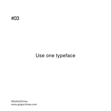
Typography guide to typeface.
Even great designers struggle to use more than one typeface. Therefore, keep your typography simple and when in doubt, stick to a single typeface.
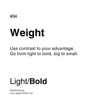
Typography font weight.
Using contrast is an excellent typographic technique to capture the viewer's attention and guide their eye to a focal point. This can be used to highlight important information and add variety, or simply mix things up by adding a little variety to a design.
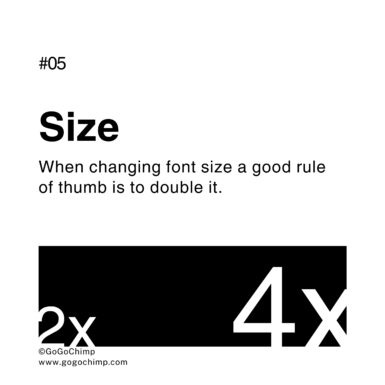
Typography font size rule.
If you’re changing font sizes, a good rule of thumb is to double it. For example, if the bost text uses a 20px font size, then your title should be 40px.
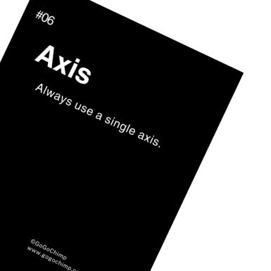
Typography axis.
Something as simple as changing the angle of your text can transform a boring and mundane design into something that's exciting and memorable. However, it's important that you try to avoid using more than one axis in your design.
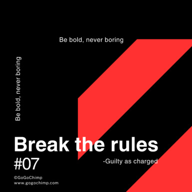
Breaking typography rules.
When you master typography, you understand how to bend or break the rules to create a design that truly stands out. Therefore, never be boring and always stand out.
Free Typography Guide
This 100% free PDF gives you everything you need to make award-winning designs using typography.


